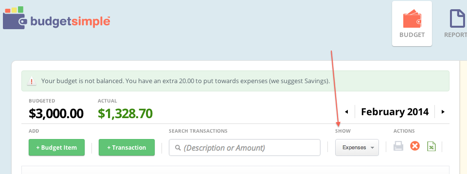
One of the features of BudgetSimple that can be confusing for new users is the different “views” we allow. These allow you to look at your budget in different ways. Today we’ll cover what you can see in these and how to change your views.
The default view in BudgetSimple is to just see your expenses. We do this because income is typically less variable, and in the end a budget is more about where your money is going than coming from (although that’s certainly important too).
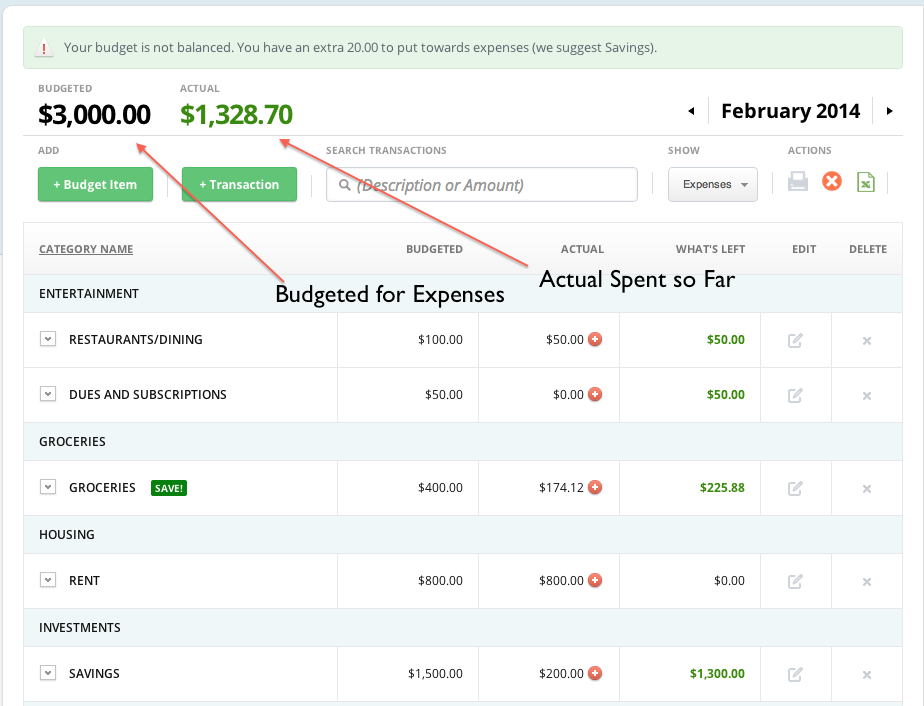
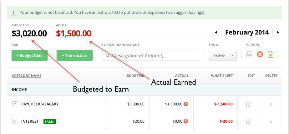
If you change your view to “Income”, you’ll see just your income in the same way:
Picking the “Both” view will show both Income and Expenses on the same page, but instead of using the numbers at the top as totals, you’ll see the bottoms at the end of each table.
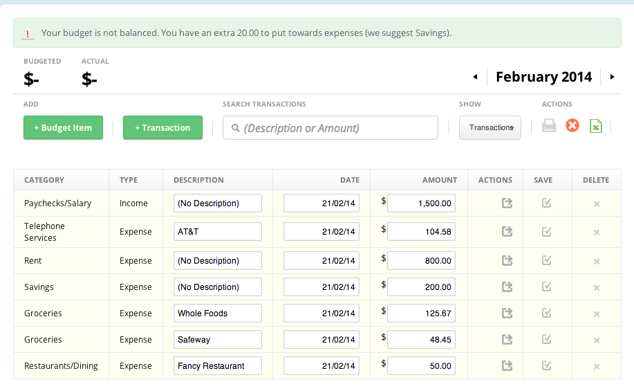
Finally if you just want to see the “Actual” transactions you’ve entered, change the view to “Transactions” which will show you the transactions ordered from newest to oldest (ones added since your last login will be highlighted in yellow).
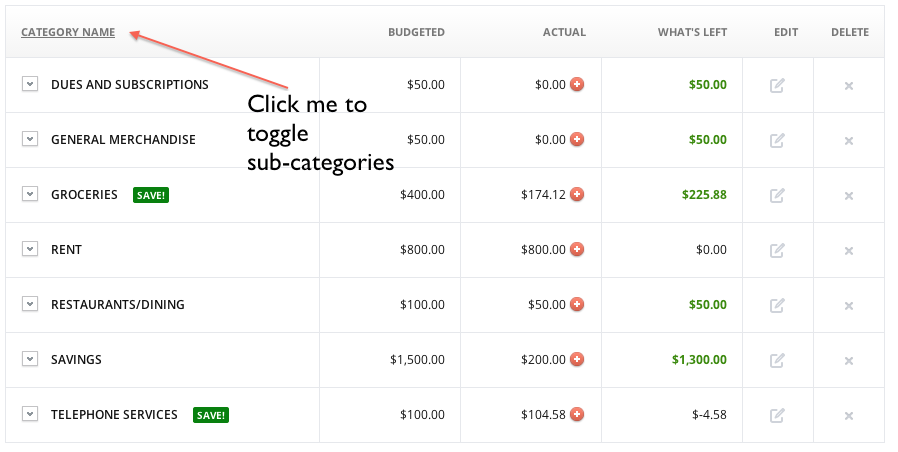
Finally, if you like a “flatter” look to BudgetSimple, and want to get rid of the “Sub-Categories” view, you can just toggle the “Category Name” column
