Since we did a tour of the iPhone app when it was released, I thought it was only fair to do the same thing for our Droid users. One of the things that makes budgeting difficult is remembering to update our actual spending on a regular basis. Making a budget plan is a great start, but if we’re not consistently recording our expenses, it’s not much use.
From the Ground Up
We’ve redesigned our app from the ground up to make data entry painlessly simple. The previous version available on the Android market was merely our mobile web app wrapped in an Android app, and needless to say we were not very proud of it. The version should be quicker, more stable, and less buggy.
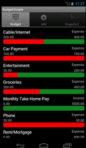
The app’s home screen allows you to view your budget and expenses at a glance. The red progress bars indicate how much you’ve spent, and the green showcase how much you have left to spend.

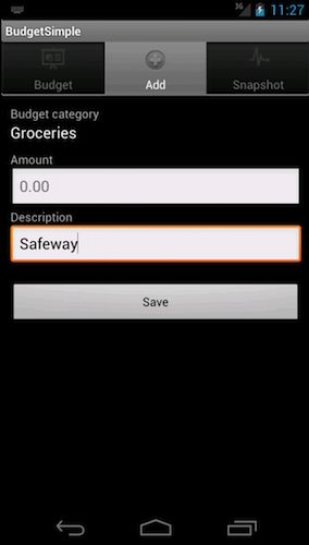
Data entry is much easier on a mobile device. Android’s touch-friendly numbers will save you a ton of time – time that you might otherwise be spending trying to navigate a website on your smart phone’s finicky browser.

A Snapshot Summary
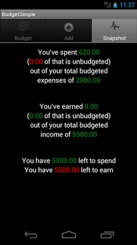
Finally, our Snapshot view gives you a summary of your current budget, allowing you to see how much you’ve spent, how much you’ve earned, and what’s left to be recorded. It’s pertinent information in real time!

BudgetSimple for Android is free and available now for BudgetSimple Plus users. Simply go to the Google Play store on your phone and search for “BudgetSimple”, or click this link from your phone. If you’re not a Plus user yet, feel free to give it a try with our 30-day free trial!

