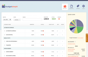
Today we released version 3 of BudgetSimple, which is a substantial overall in terms of looks from the old BudgetSimple. Almost all of the features are the same though, so once you get used to the new look you’ll find the same familiar usefulness. A few things are different that are worth noting.

The first thing you’ll notice is that income and expenses are split out into two different views. You can toggle this by clicking the “Show” button. In the near future, we’ll likely offer the ability to show both on the same screen, depending on demand.
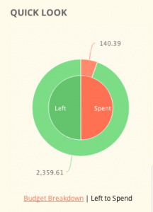
Where you used to have a bar showing the amount of actual income minus actual expenses, you can now find in the “What’s Left” graph to the right

Aside from these, the rest of the system should function basically as it did before (with tons of bug fixes!)
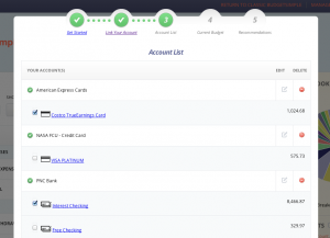
The big news is that you can now link your bank accounts, which lets us automatically categorize your spending and enter it for you, so you don’t need to remember to manually enter your expenses anymore.

This will not be required, but is a great option for some who have requested it. We support almost every major bank, but some smaller community banks are missing. Just let us know, and we’ll see what we can do to support it.

